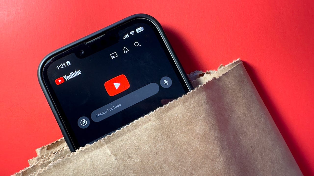
Get ready for a brand new YouTube experience. Maria Diaz/ZDNET
YouTube is one of those apps and sites that changes so subtly that most users don’t even notice until they look back at a screenshot from a decade ago.
Also: YouTube’s new program means more money for creators and more ads for viewers
But today, YouTube is hoping you’ll notice at least some of the three dozen updates it’s rolling out to make the user experience more seamless.
These are the top 6 new YouTube features
Many of these updates will be available today, while others will roll out gradually over the coming weeks.
The new features include new ways to seek, the ability to lock your screen on a video to prevent tapping out of it, new designs for the headers, collections, intro animations, and video descriptions, and incorporating the ambient theme into the light theme.
We all know YouTube videos can be unnecessarily long. Like wanting to get to a recipe on a website, sometimes we just want the host to get to the point.
Also: How to download YouTube videos for free, plus two other ways
Now, you can press and hold to increase the video’s playback speed to 2x. This helps you get through long videos faster when you need to.
YouTube is making the video descriptions scrollable and giving creators greater ability to format them. New formatting for social media links will make them easier to find and click, and even include the social media platform’s logo for better scannability. This is a big change for creators, but it’ll also make it easier for viewers to find the host’s information and other creators through the video description.
When you’re looking for a song that you can’t remember the name of, you can play it, sing it, or even hum it, and YouTube will use artificial intelligence (AI) to match that sound to the original song. This feature will initially only be available on YouTube for Android in the coming weeks.
YouTube is also adding more visual features. During a video, if a host asks viewers to like or subscribe, these buttons will animate in sync with the words on the video. If viewers press one of these two buttons, then a small explosion will appear.
Also: 10 best podcasts and YouTube channels for Apple analysis and product coverage
The activity will also look more lively, with top comments that automatically rotate below the video description as well as real-time view and like counts within the first 24 hours after a video is uploaded.
If you want to replay a portion of your video, YouTube is making it easier than ever to seek the right spot. Not only are the preview thumbnails larger than before — if you’re pressing and holding the bar to seek a keyframe and decide not to, you can just release to cancel the seek action and return to the last place you were watching.
The Library tab and your account page are now working in unison and can both be found in the You tab, which will take the place that the Library tab used to have. This change makes for a more intuitive location for your YouTube activity, combining your watch history, playlists, and purchases with your account settings and channel information.


