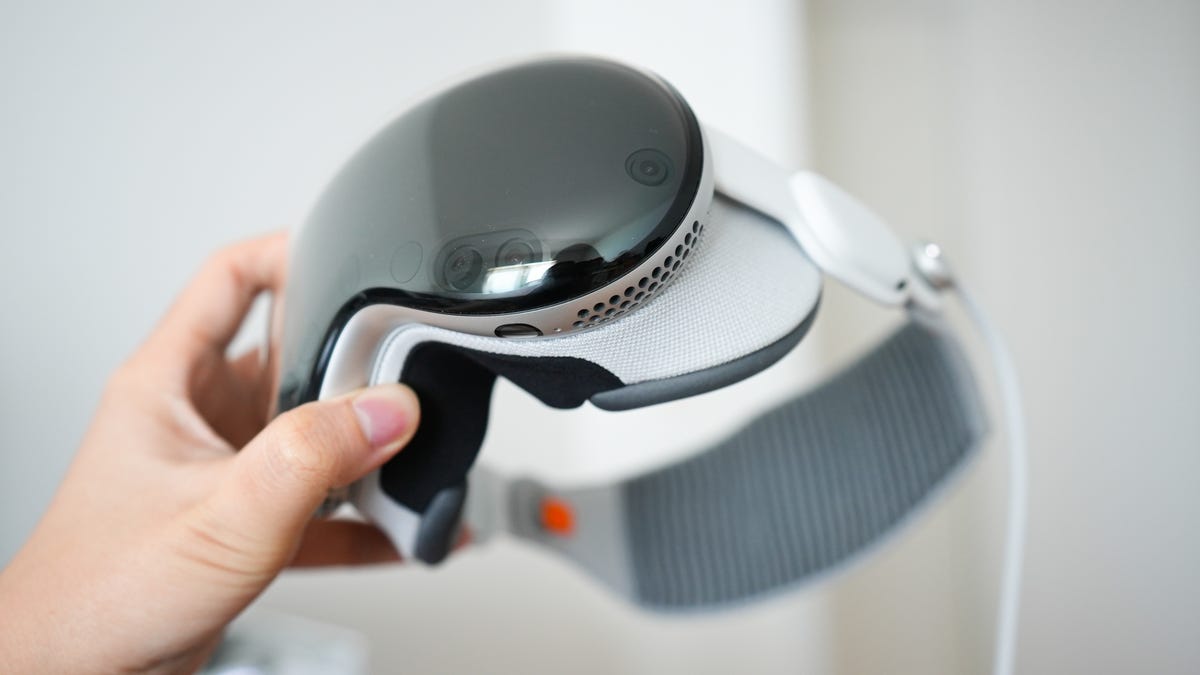
I’m not the first to say that the Vision Pro feels like a product that was made by people from the future with the materials of today. The seamless curvatures of the front glass, the blend of fabric and textures, and the various sensors that magically track my eyesight and hand movements are a testament to Apple’s crack team of industrial designers.
Save for weight distribution and how easily the Light Seal lifts off from the display front — meaning you will inevitably get your fingerprints all over the front glass because that’s a primary touchpoint, I have little to complain about with the Vision Pro’s hardware.
Also: 10 reasons the Apple Vision Pro is secretly brilliant
That leaves me with the software front, where Apple’s “first generation product” woes take precedence. From floating windows randomly disappearing to native app features that feel half-baked, as if they were rushed to meet an aggressive launch window, the software experience of Vision OS 1.0 has already left me counting the days until version 1.1 gets released. More news at WWDC, perhaps?
The occlusion of physical accessories — think Bluetooth keyboards and mice — is at the top of my wish list. While Vision Pro does an impressive job at hand occlusion, even adjusting my skin tone to the immersive environments that I’m in, accessories including Apple’s own Magic Keyboard remain hidden. It’s touch typing or saying goodbye to drafting emails from the Moon.
My smaller gripes include the lack of dark mode on iPadOS apps (including Slack and Outlook, which I often leave floating on the side), the inability to rearrange apps on the home screen, and no microphone input for screen recordings. All of which, again, may come with future updates. I’m hopeful.


