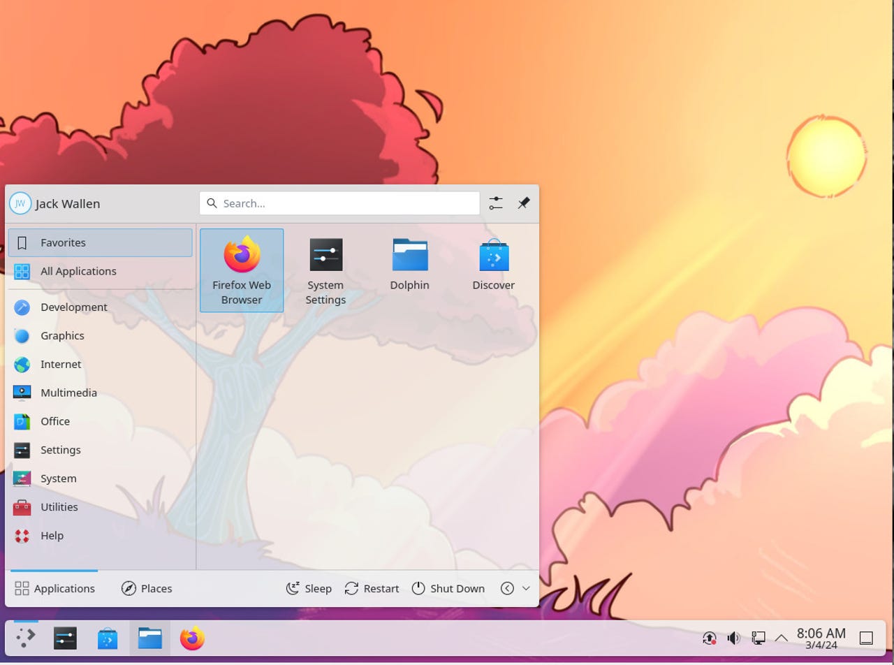
The KDE Plasma 6 desktop menu shows how elegant the desktop is. ZDNET/Jack Wallen
ZDNET’s key takeaways
- KDE Plasma 6 is available now (the easiest and fastest method is by using the KDE Neon distribution).
- It’s beautiful, fast, and highly configurable.
- If using KDE Neon stable, you’ll want to upgrade as soon as you log in for the first time.
KDE Plasma 6 is here and for those of you who were anxiously awaiting its arrival, you won’t be disappointed. For those who’ve never tried Linux or KDE Plasma, now is a great time to do so. It’s smooth, it’s beautiful, it’s stable, and it’s ready for prime time.
This also happens to be a “Megarelease.” What does that even mean? Is KDE Plasma bigger than ever? Not necessarily. Is it bolder, fresher, and better tasting? Maybe. “Megarelease” means that it not only includes KDE Plasma 6, but also, KDE Frameworks 6.0, and KDE Gear 24.02 apps. In other words, everything that comes together to make the KDE Desktop work as a well-oiled machine has all been updated to the latest release.
And it shows.
Also: The best Linux laptops: Expert tested and reviewed
Not only did a lot of work go into “under the hood” stuff, but getting everything working with Qt 6 (the foundational that works to ensure seamless integration with the desktop) but you’ll also find features like the floating panel (now the default), a refreshed default theme, Wayland as the default, and the return of one of my favorite desktop effects of old…the desktop cube!
KDE Plasma 6 is, hands down, the most beautiful iteration of the desktop I’ve ever seen. But it’s not just what you immediately see that makes this special; it’s also the speed at which everything works, the smooth animations, and, yeah, the new wallpapers.
I’ve already written my first reactions to KDE Plasma 6 and found it to be familiar to KDE Plasma 5 with several key (but subtle) differences. The official release of KDE Plasma 6 just solidifies that initial opinion and has me believing KDE Plasma might well be the best desktop environment for Linux on the market.
And it’s not even close.
Trust me, I was as surprised as you might well be. I’ve used nearly every Linux desktop and I’d never once considered KDE Plasma as my default. My problem has always been that it looked too much like a Windows interface and I wanted nothing to do with that.
But this latest iteration has me questioning that stance…because it’s just so good. I can even shrink the floating panel so it functions more like a dock. With that configuration, it’s more like an elementary OS or Ubuntu Budgie than a Windows UI. Couple that with the transparent menus and it’s 100% up my alley.
Yep, you can turn the KDE Plasma panel into a dock. ZDNET/Jack Wallen
If you’re curious about the new features in 6, they’re pretty much all over the place (this is a major release). Let me sum them up.
- Floating panel as default (with new, optional, auto-hide feature).
- New Overview screen.
- Alt+Tab displays a new grid for open apps.
- Defaults to double-click.
- Tap-to-click is enabled by default (for those with touchpads).
- Click on the scrollbar to move to the location you clicked.
- Plasma Search is much improved.
- KDE Gear has been updated.
- 3D Cube desktop effect.
- Wayland as default.
- Fewer nested pages in the Settings app.
- New sound theme.
- Partial support for High Dynamic Range (HDR) displays.
When I came away from using KDE Plasma 6 (via KDE Neon), I felt a sense of comfort; like I’d slipped on a new pair of glasses and everything was suddenly crystal clear.
Also: 5 ways I use Google Keep for maximum productivity (and you should too)
Along with that comfort comes serious speed. I think this is the first time I’ve ever experienced the KDE Plasma desktop running as fast as this. Applications open and minimize/maximize almost immediately, and the search is just blazingly quick. And, of course, as always, with KDE Plasma, there are tons of customizations to be had. You could spend hours tweaking the desktop and still keep finding more fun.
KDE Plasma 6 (via KDE Neon) is a blast and might well have convinced me to make the switch. We’ll see how much I miss that beautiful desktop as I return to my default.


