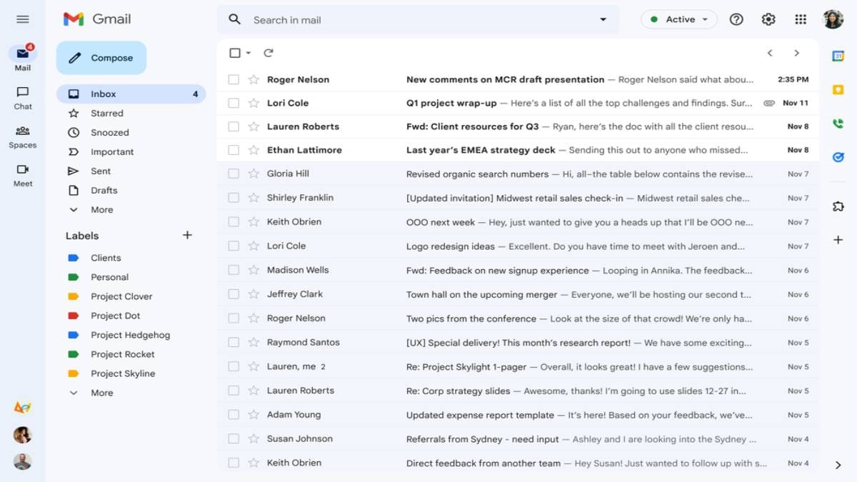
Google started rolling out a set of design changes for Gmail, including a Material You design that was announced earlier this year. Now, it is being rolled out more to the users on both personal and work Gmail accounts. The new integrated Gmail view will be available to users who have turned on Chat. The redesigned email interface features a sidebar that allows users to switch between all four Google’s services — Mail, Chat, Spaces and Meet — in a single column.
The updated Gmail interface is now widely rolling out, according to Google. It includes a new integrated layout for the platform, including a sidebar to the left of the Gmail interface that allows users to switch between Mail, Chat, Spaces and Meet easily.
Many users are now able to access the Material You redesign in Gmail. The redesign shows the default background of the platform going blue and the Compose FAB (Floating Action Button) turning into a rectangle box with rounded corners. Notably, users can still opt for the original view of the platform by tapping the settings icon and heading to “Go back to the original view,” and to “Apps in Gmail” in order to remove Chat, Spaces, and/or Meet.
Meanwhile, Google explains the new changes as, “Using Quick settings, you can select apps you’d like to toggle between on the left side of your window, whether it’s Gmail by itself or a combination of Gmail, Chat, Spaces and Meet. Label lovers will see separate sections for system labels (like Starred, Snoozed and Important) and custom labels you make yourself. And people who love to chat will see conversation bubbles with snippets of incoming messages, along with options to quick reply instead of opening the full message.”
In addition to the new interface, Google is also adding Search chips to the top-right corner of the Gmail inbox, likely making it easier for users to filter the messages. The search chips appear as a row to refine results next to the page switcher/arrows in Gmail. However, this feature is not rolled out yet for the users even in the Material You redesigned platform.
Google also revealed some upcoming improvements for tablet users, including better emojis, new accessibility features and more, later this year.


