Every year, around this time, I sit down and come up with a wishlist containing what I want Apple to add to the next version of the iPad’s software. Apple holds its annual Worldwide Developer Conference (WWDC) every June, where the company gives users and developers an early preview of the next major operating systems for its growing list of hardware.
This year, we’ll get our first glimpse of iPadOS 15. The announcement comes just a few weeks after Apple released a new pair of iPad Pro models, both of which feature the M1 Apple Silicon processor
. That’s the same chip that’s found in the newest MacBook Air, MacBook Pro, Mac Mini, and iMac
. Yes, the iPad Pro’s performance is on par with Apple’s Mac lineup now.
With all of that power, iPadOS is primed for a huge update that (hopefully) brings more advanced features and capabilities to the tablet lineup.
This week I read my wishlist for iPadOS 14, and sadly, it’s all still there, waiting for Apple to implement: Multi-user support, better external monitor support, and widgets on the home screen, among others.
This year, my wishlist not only includes some of those same features but is gaining a few new items.
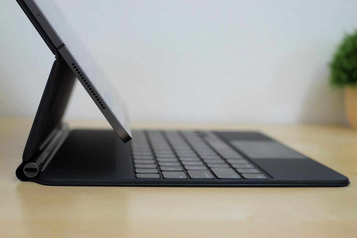

The Magic Keyboard’s hinge has a USB-C port for charging the iPad Pro.
Jason Cipriani/ZDNetThe low-hanging fruit
Every iPad software update seems to have some sort of addition that has been asked for by users for years, giving Apple plenty of time to slowly build and work its way towards it. For example, the addition of the Files app was a common request. So was a desktop-class version of Safari on the iPad, moving away from the mobile version of Apple’s browser. Here are some of the features that, by now, should be something Apple adds, if for no reason, other than to make iPad owners happy.
Multiple user support
The fact that this still isn’t a possibility on the iPad confuses me. The iPad, even before the jump to the M1 processor, is more than powerful enough to handle multiple user accounts. Maybe it’s been a storage issue or trying to figure out how to let each user have their own set of apps without running into issues. I’m not sure. The entire iPad lineup, from the 8th-generation model all the way up to the new iPad Pro, would benefit from the ability to share a tablet in your home or at the office.
Widgets on the home screen
Last year, Apple gave iPhone owners the ability to place a new style of widgets anywhere on their home screen. There are set sizes and styles, but you’re able to move app icons out of the way and replace them with widgets that routinely update and show you various bits of information.
Oddly, the iPad didn’t receive the same treatment. It seemed like an easy addition, seeing as iOS and iPadOS still share a lot of the same features, but alas, widget support was relegated to a single column on the left side of your home screen and nothing more.
I have a feeling that Apple didn’t release the same widget support on the iPad because there are bigger plans for a home screen redesign, but if I’m wrong, the ability to use those same widgets wherever a user wants is sure to make many iPad faithful happy.
Improve the Files app
The Files app works and works well as long as you stick to doing basic file management. If you want to rename multiple files, for example, you’ll need to find some sort of Shortcut that allows you to change the name of a batch of tiles, and even then, it doesn’t always work.
I realize there’s a fine line Apple needs to walk when it comes to making the iPad too complicated or too much like a Mac, but I think the company can afford to add more power-user features to Finder, making it a more robust file management app that’s built-in out of the box. As it is right now, the Documents app from Readdle feels like a worthy replacement. That is if you know about it.
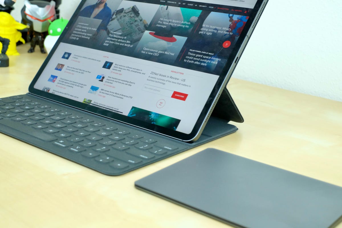

The iPad Pro with Magic Trackpad 2 is a nice setup.
Jason Cipriani/ZDNetPie in the sky
With the launch of the most powerful iPad Pro ever, if all Apple does is pick some of the low-hanging fruit and call it a day, there will be a lot of disappointed iPad Pro owners.
Pro apps for the iPad Pro
There have been rumors and talk about pro apps like Xcode or Logic Pro making the jump to Apple’s touchscreen computer, but we’ve yet to see it. After the transition to Apple Silicon and ARM with the M1 processor, and Apple’s recent push for developers who make iPad apps to bring them to the Mac through the Mac Catalyst program, it certainly feels like the process to transition the Mac-first apps over to the iPad will certainly take some work, but it should be closer than ever. What’s to stop Apple from reversing the development process from putting iPad apps on the Mac, but instead putting Mac apps on the iPad?
I can’t think of many reasons outside of the transition from a point-and-click interface on the Mac, to a touch-first interface on the iPad.
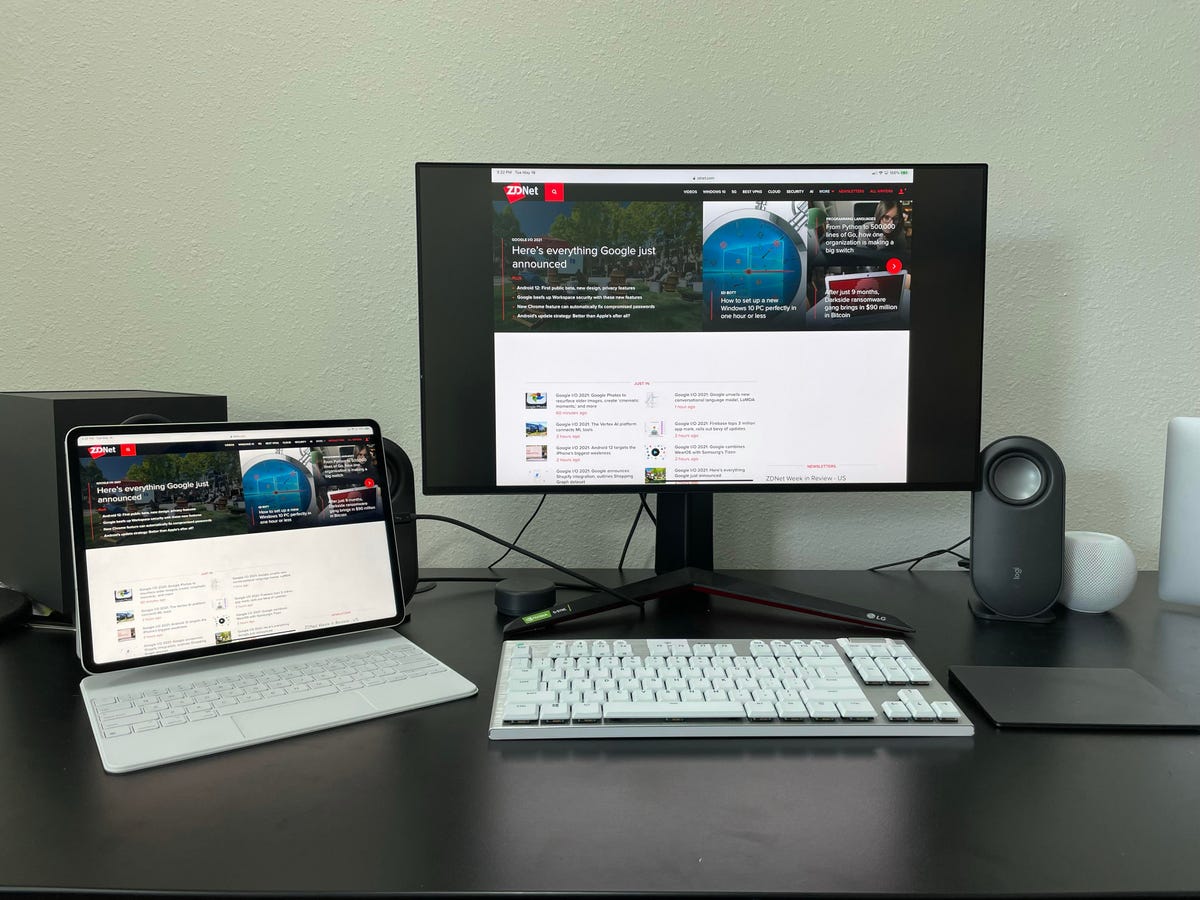

In 2021, the iPad Pro should support external displays. Not… whatever you want to call this.
Jason Cipriani/ZDNetTrue external monitor support
This one should technically be in the section of this post because it seems so obvious for Apple to add this year. For those who’ve never connected an iPad to an external monitor, you’re limited to using it as a mirrored device. And even at that, you don’t get to take full advantage of the display it’s connected to because it’s letterboxed.
With full external monitor support, you’d effectively have two home screens — one on the iPad, another on the monitor. Both of which should be able to run multiple apps, in full screen, split view or slide over multitasking (assuming those stay around, but more on that in a minute).
Going one step further, there should also be an option to use the iPad in clamshell mode, where the iPad’s screen is turned off and only the external monitor is being used. Pair that with an external keyboard and a Magic Trackpad 2, and you finally have true external monitor support.
Time for a new home screen experience
As I already said, adding widgets to the home screen is something that will make iPad fans happy. Heck, I’ll be happy. But I would love to see a bigger fundamental change to the iPad’s home screen. Instead of the app grid we currently have, something like the Mac’s Launchpad that serves as a big app drawer — or, excuse me, it’s called App Library on the iPhone — would be fantastic.
I spend far too much time arranging and rearranging my iPad’s home screen simply because there’s nowhere to put all of the icons. Scrolling through page after page of icons to find an app you need is laborious. Using Spotlight to quickly search for and launch an app is far easier.
Adding App Library and widgets on the home screen should just be the start, however. Things like folders to documents, or a shortcut to a specific file within an app like Word or Google Docs, would be a boost for productivity.
To be clear, I’m not asking for a Mac-like desktop. I still want this to feel very much like the iPad interface I’ve come to enjoy using. I just want more options and control (and yes, that means getting rid of the rigid app grid).
The rebirth of multitasking on iPad
A couple of weeks ago, I was working away on my iPad Pro, when I suddenly realized how much I’ve grown into the iPad’s multitasking setup. From opening apps in split view to using slide over (and quickly switching between those apps), I can fly around on the iPad as confidently and efficiently as I can on a Mac.
That said, it’s taken me a long time and the release of trackpad support to fully embrace multitasking on Apple’s tablet. There are plenty of issues or areas where you have to pay extra attention to what you’re doing. Heck, there are a lot of multitasking features that people just don’t know about. Moving a slide-over window from one side of the screen to the other is possible, but getting it back to the right side of the display can be confusing. The same goes for hiding the slide-over window. Once you get the hang of it, it’s intuitive, but it’s too hidden to be considered discoverable.
Apple needs to rethink multitasking on the iPad. Keep the stuff that works, like split-screen apps. Then rethink the approach for slide over (but don’t get rid of it), to make it easier for users to discover and use regardless of whether they have a trackpad, mouse, or are using their finger to get around.
And for the love of all things iPad, please make it easier to switch between two text fields in different apps. I’m tired of mistakenly typing an iMessage reply in the copy of an article because I thought I clicked in the right text field but the iPad didn’t make the switch.
What are you hoping for at WWDC when it comes to iPadOS 15? Let me know in the comments below.


