Seventeen-year-old New York-based hosting firm Squarespace has been dubbed by one Wall Street stock analyst “the iPhone of hosting.”
That description is apt in more ways than one.
Like the iPhone, there is a slick quality to many elements of Squarespace that is user friendly, especially to people with limited technical acumen, such as picking pleasing templates for blogging that provide an immediately attractive visual feel.
And similar to Apple products, the veneer of ease can produce a false sense of security. There are times when Squarespace won’t function the way you’d wish, and when it can cause frustration with functions that suddenly break, with little recourse except to be patient till it’s remedied.

And much like Apple, Squarespace is something of a walled garden. The service tends to focus on a curated list of features, for which customization and expansion via third parties are severely limited.
Given those pluses and minuses, Squarespace is a tool for those who want primarily ease of use for a basic blog or commerce site but who are more adept than an absolute beginner to deal with the inevitable gaps and shortcomings.
What follows is the first-hand experience as a user of Squarespace for almost a year in the development of the technology stocks blog The Technology Letter, which is hosted on Squarespace.
Who it’s for
Squarespace is for the semi-technical user who can grasp and work with some basics of how to set up a blog or a store. For example, you may need to familiarize yourself with how to set up a domain, link that domain from a registrar, such as GoDaddy or Network Solutions, to Squarespace’s domain settings, although Squarespace does provide integration with GoDaddy, Google, and Namecheap whereby you can add a domain without having to tweak settings.
It does help to know the ins and outs of managing content pages, template settings, and social media engagement to get the most of the service.
Each one of those elements brings its own headaches, so Squarespace is by no means a push-button affair. At the same time, scaling up a site means running into some limits to growth, such as the lack of a central database from which to pull various content items in a reusable fashion.
Squarespace has particular appeal for those who want to open a storefront to sell services, like personal training, or sell physical goods or digital downloads. Payment processing is easy to add, as are shipping functions. And the more expensive Commerce package offers extensive analytics about shopping cart use and how customers flow through the funnel of buying.
One Wall Street analyst covering Squarespace’s stock, Christopher Merwin of Goldman Sachs, who has dubbed the platform the iPhone of hosting, notes that Squarespace is a walled garden. The platform “maintained relatively few integrations with third-party vendors of other software and services.” For example, Squarespace “offers 24 extensions on its website,” notes Merwin, “as compared to Wix, which offers 250+ extensions.”
For example, Squarespace at one time offered social share buttons to let people send your article to Twitter and the like. At some point, the company did away with that, forcing users to use header code injection from third parties such as Shareaholic and Sharethis.
The Squarespace experience
Most of your time with Squarespace will be spent in the Dashboard, a simple column of menus including site settings. At the top of that column of sections is the Pages Panel, which is where you’ll your time creating your site’s pages. All of this has a clean, simple look to it, so it’s relatively easy to navigate into and out of the different areas of the Dashboard, and to work within the Pages Panel.

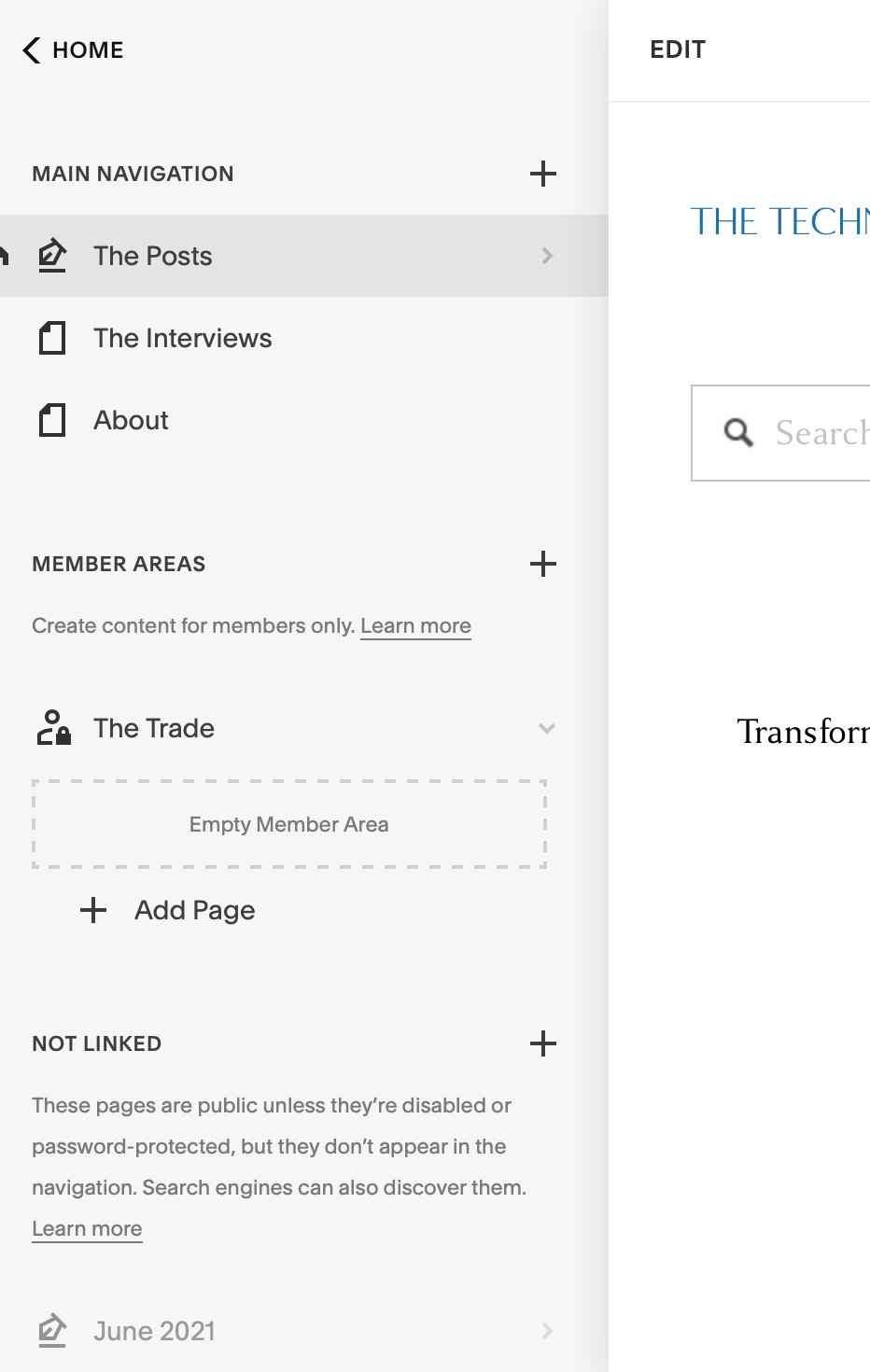
The Pages Panel is where you manage your site’s elements.
The Technology LetterThe Pages Panel is further broken into three sections. What’s called the Main Navigation, at the top of the panel, is the group of pages that always show up in the site navigation links on the home page and on every other page that you put in this group.
Further down, there’s a section for unlinked pages if you want to make a page publicly accessible but have it not show up in the site navigation. And if you buy an add-on feature called Member Areas to sell people subscriptions, you’ll see a third section of the Pages Panel for those member pages. The member pages also do not appear in the site navigation unless you deliberately create a link in the Main Navigation group to link to those member pages.
The best part about Squarespace is the focus on building from templates and blocks of content. By default, pages, including catalog pages for product listings, and blog pages, are fairly handsome templates with a modicum of modifiable font and layout options. You can easily get a very professional look and feel with any of these.
There are two main kinds of pages, “layout pages” and “collections pages.” Layouts are rather free-form, where you are mostly assembling blocks of content as you like. Collections, including blogs and product catalogs, are pre-built to group together items, such as blog posts.

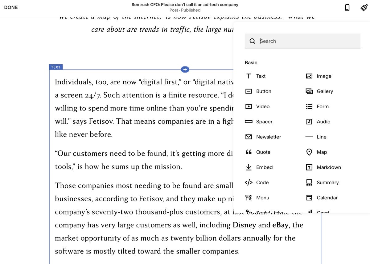
Composing pages is a process of adding content blocks from the menu that appears when you hover over a section and see the little plus sign.
The Technology LetterRegardless of which you choose, building and revising pages is about adding blocks of content, such as a text block, which is a rectangle with a text editor to input and format text, or an image container that shows an image picker. You add each one by clicking a plus button that shows up on mouse-over, and you can drag these items around the page. The way blocks snap together is fairly slick.
All editing by default is WYSIWYG. If you want to do HTML markup, you can choose from a functional block called a markdown block instead of the WYSIWYG text block. You can also change your settings to make the markup your default. In site settings, within the advanced section, you change your default text editor to the “Markdown Editor.”
Blocks of content are also available for email sign-ups. If you sign up for Squarespace’s email campaigns, you can set up what’s called an “automation” to send each person who signs up a follow-on email confirmation, which you can tailor in terms of content and appearance. You can also prepare email “blasts,” a message to an entire mailing list, such as, for example, a daily newsletter of content.
Like making pages in the Pages Panel, email automatons and blasts are prepared with a WYSIWYG, drag-and-drop method in the Marketing section you access from the Dashboard. Squarespace has done a nice job of making it easy to build from the same content blocks you use while also making it possible to pick out blog posts from a menu if you want to make them part of your email.
A fairly extensive set of hyperlinked documentation in Squarespace’s Knowledge Base does a good job of explaining the various features, including step-by-step instructions and video guides.

You can get an elegant look for a blog page, say, just by picking a template.
The Technology LetterA focus on selling
Outside of the slick UI for editing, the main differentiator of Squarespace is the emphasis on selling things. The basic page templates are able to be set up for selling services, either on a pay-per-use or a subscription basis; selling physical goods, with catalog layouts for product pricing and descriptions; or digital content, such as files, for download. A fourth option is the Member Areas mentioned above, by which one can sell password-protected areas of content.
To take payments, one can turn on both PayPal and Stripe, the latter for the purpose of taking credit cards. The Dashboard has a link to those services to set up or add an existing account.
Squarespace also allows one to integrate with Square’s card reader to take payments at the point of sale (POS), which are then integrated into the Squarespace account using a separate iOS or Android app for Commerce. (In case you were wondering, there is no connection between Square and Squarespace, they are totally separate companies.)
Squarespace provides a number of data points to track how customers move through the shopping funnel in the Analytics section of the Dashboard, starting with how many people visited, who viewed a product, who added something to a cart, and who purchased.
There is also extensive information on unique visitors and visits, time spent on particular content, site search keywords, and the number of RSS subscribers.
Even if you’re not selling stuff, you can still use analytics on Squarespace to see your traffic levels. There’s also integration with Google Analytics for a deeper dive into your numbers using Google’s own site crawling. In practice, Google’s analytics tend to update more frequently, while Squarespace’s built-in crawling can have a delay of an hour or more.
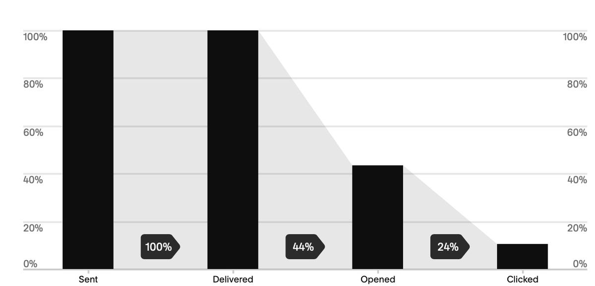
Email blasts also come with their own analytics, showing how many people opened an email and how many clicked on a link in an email.
While well thought out, the curated list of commercial features feels somewhat lacking for the most part. For example, there are not capabilities for features such as chat or forums or any other interactive elements. Integration with a third party for such capabilities would be a welcome addition.

Email blasts will report metrics of how many people opened an e-mail and how many of them clicked on a link.
The Technology LetterPlans and pricing
Squarespace has four plans, with add-ons for additional capabilities. The basic plan starts at $16 per month, or $12 if you pay for the year up-front. Business plans add more extensive analytics tools and things such as promotional pop-up capabilities for your site and other “premium” features.
There are then two versions of the Commerce plan, the Basic and Advanced, at $35 and $54. You have to have one of these if you want the ability to give site visitors their own customer account login.
An example of the differences between the two includes the ability, with the Advanced plan, to automatically calculate shipping costs via UPS or FedEx for customer orders and to send an automatic email reminder to a customer when they have abandoned the checkout processor their shopping cart.
In addition to the four plans, you’ll pay extra to add member areas if you want to sell password-protected content, starting at $10 a month and increasing in price as you add more member areas. Sending email campaigns, as an alternative to, say, Mailchimp, costs extra as well. Prices start at $7 and rise to $68 per month depending on the number of email campaigns you want to send and how many recipients.

Squarespace has a pleasingly simple approach to pricing. Bear in mind that things such as e-mail campaigns and password-protected member areas will come with additional monthly fees.
SquarespaceSquarespace limitations
Behind the ease of use and the well thought out aspects of Squarespace, there are limitations that one will have to contend with on a daily basis.
Support for WYSIWYG editing is uneven between desktop and mobile. For example, drag-and-drop elements of page design, the various text and image blocks, can’t be dragged in mobile browsers, only on the desktop. The limited layout is possible in terms of adding or deleting blocks.
That means the page layout has to be confined to the desktop.
Squarespace has its own iOS and Android app, which has uneven performance. For many basic tasks, the app is fine, including some page creation, mailing list maintenance and site traffic analytics.
However, holes crop up quickly. For example, when editing text in any standard text field on a page in the app, the formatting pop-ups that appear on the Web page version are absent, forcing one to go back to the Web to do formatting.
Among the severe limitations advanced users will run into is that content elements, such as blog posts, are tied to the pages with which they’re created. There is no way to, for example, has a blog post be linked across multiple pages. The same goes for product listings; they live within the container of the page in which they were formed.
That is less than ideal, and one starts to wish for what you might call a database, in other words, a repository from which to draw elements as you like for any given presentation page.
A workaround is to design a collections page, such as a blog page that is not linked to the main navigation, and then use a content field on the main page that is called a “summary” field. That summary field can be populated with items from the collections page, such as the blog posts. The collection page becomes the underlying database, and the summary field becomes a kind of SELECT statement in SQL.
The lack of a database of content is especially striking considering the architecture of content blocks. In theory, content blocks should be not only templates but also stateful objections that can be repurposed. If, for example, a blog author creates a text block on a given blog post, it’s conceivable the author might wish to re-use that content block, not the template, but the actual custom block, somewhere else on the site. Instead, you’ve got to scrape what you can, such as the text content, and re-create the effort in a new object.
Squarespace’s back-end content management has glitches. One can encounter on any given day multiple error messages on Squarespace when committing a change to a blog post, say, or an email campaign draft, and when you see the error message after clicking save, the result is usually a hung page, and the need to reload the page, which usually clears the most recent changes made.
The result is that sometimes one can feel like one is walking on eggshells, handling a very fragile CMS. While not a deal-breaker, perhaps, be careful to save your work often when developing parts of your site or even when you’re updating a blog post so that you don’t end up losing your work.
More serious errors occur when things don’t connect. For example, when designing an email campaign, one may want to link to an existing blog post. That procedure is made very easy, with the same functional blocks that can be mixed and matched in either an email template or in a blank Web page.
However, it can all come crashing down when the latest blog post suddenly doesn’t appear in the blog post picker from within the email draft. Appeals to support may be met the answer that the problem is unclear, and further research is required. This, obviously, can shut down the entire marketing function for a Web site that relies on email blasts.
That is where it pays to be less dependent on Squarespace’s slick templates, or, at least, to understand that dependency. When a blog post fails to show in the blog post picker in the email campaigns draft, one can still retrieve that blog post by simply building the email draft from scratch, and assembling text and image and then attaching the URL for the blog post.
In other words, there are times when you’ll have to forego some of the pre-built conveniences you usually rely on.
Lastly, the curated list of features on Squarespace, and the lack of more extensive integration with third parties, means that you may have to rely on code injection in Web page headers. That’s fine, except that it can multiply the headaches.
If, for example, a problem comes up with some aspect of one’s site, such as when blog posts won’t load in an email blast blog picker, Squarespace support will request custom header code be removed temporarily while they investigate the problem. The rationale is that changes to Squarespace’s platform can cause custom header code that had been working fine to suddenly not work fine, and so the custom code needs to be quarantined in order to isolate the problem.
The result is a tug of war, with users wanting to insert code to make up for Squarespace’s deficiencies but Squarespace having to push back from time to time on code they can’t control.
Support is available via email and via chat, the latter being during normal the period 4 am to 8 pm, Eastern time, Monday through Friday. In general, the support team manning these chats will spend time taking a look at the problem and are fairly knowledgeable about the service. However, whenever bugs crop up, such as the email blast issues mentioned above, the resolution will usually take some time, occasionally 24 to 48 hours, to resolve.
The most egregious support issue is that the focus on features by Squarespace sometimes means that fundamental capabilities are left as a secondary priority.
For example, early in my development of The Technology Letter, blog post URLs, which are supposed to mirror the title of a post, instead appeared as strings of garbage characters. That’s bad if you want URLs that show up nicely in, say, a tweet. I notified Squarespace and was told that they realized the issue, but that resolution would have to wait as there was a lot of other work to be done.
My workaround was to make sure to manually edit the URL of every post in the settings panel for the post. Squarespace finally fixed the issue, but it wasn’t until months later.
In summary
In summary, if you have a modicum of technical ability and you want to quickly put up a shop or a blog that looks good for not much money, Squarespace is a good choice.
Be prepared, however, to have to work around many limitations, probably shortly after you go live and on a perpetual basis. That includes both the functional limitations and also the frequent service gotchas that simply must be endured.


